Using A4 format folded twice will give a ratio that reflects my existing poster designs. It will be large enough for the viewer to comfortably be able to read the text, yet small enough to not impose.
Title page:
I think this play on words makes for a good slogan. At first I was thinking 'A little change can make a big change'. However, after asking numerous people which they preferred it came that the first was more "humane"- it was as if one of their peers was talking to them. They could "relate" to that more colloquial phrasing.
I think the small text and left alignment gives a simple look that I want to convey.
My initial infographic on change within bags would work well across one side of my leaflet, slowly revealing information as the viewer opens it:
- To begin with the viewer would just see the red and pink dots, then keep opening up to more. They would be intrigued as to what they meant. I think text is required here.
Here I have begin using the grid technique to make sure there is consistency to the layout of the design. I did this on Illustrator using the 'guides' then 'locking' them to make sure they didn't move whilst I continued on my design.
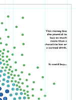
Below is a variation of the right sided text. I think that lowering the last sentence and adding and ellipsis encourages the reader to turn over, implying there is more to come.
This side of the leaflet works well open as a whole. I think this would also work well as a poster.
However, much like the poster I think it needs a key to further explain what the imagery means.
Now,
What could be bought:
I think that again, one of my existing infographic designs would work well- if the viewer has already seen the poster they will make the visual connection between the matching imagery and create a stronger association.
For my third poster design I used a more regimented triangular shape. This will give more consistency to the design given that the design above is also triangular.
The fact that there is less space means that it would have to be more condensed. So it makes sense to use this design:


No comments:
Post a Comment