Tuesday 29 November 2011

Preliminary Research

Research into two words their connotations/ meanings/ readings etc.

Researching into these words will enable me to engage fully in Thursdays workshop and come up with some good ideas before designing in AfterEffects.

First of all:
Words associated with Disperse:


Words associated with Float:


After Effects Induction


Thursday 24 November 2011

Design Production, Digital.


For the amount of work that I am going to produce for this project we have been advised to create a Vimeo account as it wouldn't be feasible to screenshot all the digital work we will be creating.


Tuesday 22 November 2011

Final Work.


Collection of products/ branding include: Promotional posters; t-shirts; t-shirt packaging; business card; letter head.

The repeat pattern on acetate is supposed to mimic a cellophane wrapper for the t-shirt.  Seeing as I couldn't print onto the cellophane due to it being too malleable and shiny I thought this was the next best thing that would visually replicate it.

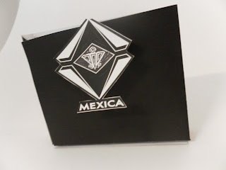
 Sticker for the bag that stays stuck once ripped open at the top, serving as a decoration once its function has been fulfilled.  Printed black ink on heavy gsm black stock, I then foiled the black in with glossy white foil to give a spot varnish effect.  The bright orange ribbon is supposed to inject a hint of colour against the stark monochrome branding, whilst also hinting at the colourful print within.


I have screenprinted my design onto a t-shirt using two colours- red and black.  Overall I think it works well,  however the only reason this colour scheme has been adopted is because unfortunately, prior to me printing,  my screen was not exposed properly, leaving many gaps in my designs.  This is how I have overcome it.


The tag at the bottom of the tee adds a sense of quality whilst reinforcing the brands identity.
Below is the proposed stock I initially wanted to print onto, but had to change once I realised it was impossible with the available facilities to me.


Not the best photo, but very hard to take an image that would depict what this is.  The lining of the bag.  Here I have printed onto acetate and stuck it on the inside of the bag.  I wanted to achieve a black ink on black stock finish, but unfortunately with stock this size it is not possible with the available facilities. 


Monday 21 November 2011

ISSU, Top Ten Print Tips.
ISSU Top Ten Print.

Final ISSU document:

Open publication - Free publishing - More colour


Alternative:

Open publication - Free publishing - More colour


I think that the basic CMYK design works better with the concept behind the manual.  The gradient image is visually pleasing but I would have no other reason for using it other than the fact that it looks good.  However, I may incorporate this process into my designs.

Sunday 20 November 2011

Sticker design.

Sticker designs.
It took too long to get these right.  Learning out the hard way every time.

At first my plan was to just print off my logo and fold it over the top of the bag to keep it sealed.
I then thought it would make sense to be able to see the logo from each side, so I had to design a sticker and manipulate my logo for this to happen, and unfortunately, this is where my simple mind got it wrong.


So, first of all, I used a rectangular piece of stock and printed two logos on it.  Once I printed it off and after i'd stuck it on I realised the logo was the wrong way round on one side.


Then I go spend a whole lotta money down in the digital dungeon on the vinyl printer/cutter, only to realise when I stick it on the bag that I printed the logo incorrectly.

However, by now I had realised that this design was working, even if the colours were wrong.  By replicating the logo on either side like shown above and then linking the two where the vinyl cutter would leave it would be strong enough to hold the bag together, but weak enough to keep the rest of the sticker on the bag instead of ripping down- giving the bag a spot varnish logo that has a physical function as well as a visual one.

Final mock-ups.  Correct.


In Context.


In context.  Promotion and Identity for the brand.  Visualising within a real environment is important.  It means you are able to see if your designs work in different scales and environments.  I think here the large scale poster works very well within that context.  The simplicity and impact of the chosen colours makes the poster pop out against the others (of which also use monochrome colour scheme).
The poster would benefit from a slow reveal promo.  -You first see the imagery everywhere, stickers, posters, mailshots etc, and after people have got talking about the image you send the next area of information, for example, I could just put a date and a location i.e.the shop and have a grand opening.

I think the Photoshop images within an actual clothing store work well.  The area suits the audience I am going for along with the environment I want my tees to exist in.  Wall Vinyls look very interesting and are something I should definitely consider taking forward.

Friday 18 November 2011

Final Bag design.


Final bag net.  Using black, approx 150 gsm stock, I will create a bag for the tees to go in.  I felt that using this stock rather than a typical plastic shopping bag would give it an expensive edge.  An aspect I want to achieve, given my target audience.

Thursday 17 November 2011

Development, Bag Design.


initial shopping bag net:


Initial shopping bag mock-up.  It is here where I got my first idea to create a sticker for the bag closing.


Above is my experimentation with a sticker over the seal of a bag.  This makes a single stock bag look a lot more interesting.

For a long time I was deciding between a white boarder and pure black bag.  I eventually decided on purely black stock, with just one sticker over the side.  The sticker design is supposed to remain on the bag as part of the branding and identity.  When the customer opens the bag, the stickers will stay on the sides because of how thin the joining area is.  The design of the sticker will reflect the letterhead design.  The white areas will be spot varnish with the rest matt black, to add a finish of texture and quality.


Tuesday 15 November 2011

Letterhead design.


Experimentation using the foil blocking process for a letterhead design.

A few design sheets later, this is what I came up with:
 Which then turned physically into this:


Here I have printed black onto black stock, placed foil over the print, and inserted it through a laminator.  The result is just as good as a heat press is capable of producing.  The idea of using this foil was to represent a spot varnish.

The concept behind using a spot varnish was to enhance the simple monochrome colours used throughout the brand as a whole.  It also adds quality to the product, along with the brand itself.  This is suitable for my audience because of the types of shops I am aiming it at.