
Saturday, 20 November 2010
Tuesday, 16 November 2010


Wednesday, 10 November 2010
No News Is Good News- Part 2. Message and Delivery

So from these final pieces we've been asked to design a 'mail shot' for a specific audience that would be relevant to our cause and subject matter.

We needed to decide the 'Whys; Whats; Hows and Whos to put the whole thing into context, and to get an idea of where to start off with this.

Preliminary Ideas:

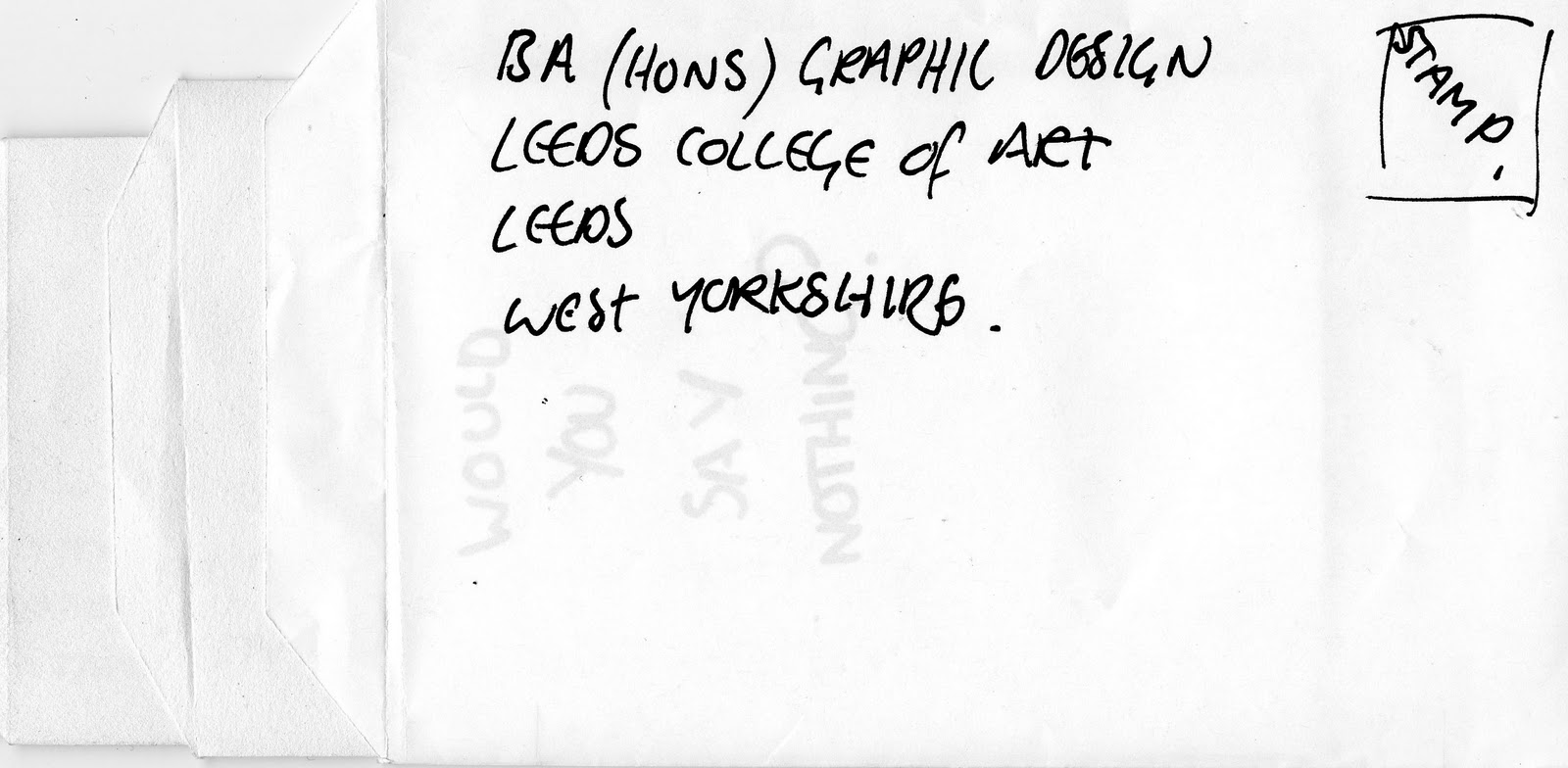
WOULD YOU SAY NOTHING?

This type of fold out method would reveal information slowly. I think it would be an effective way to cause a lot of impact on the viewer. Especially the first thing they see being a question- it engages and also forces them to think about what they are going to be looking at.

The idea above also translates into an official letter that someone would receive through the post. However, it could be effective through its seemingly official design that draws them in. Larger point sizes used on specific words of importance would give focus to someone that is more inclined to scan through a letter.
Pop-up:

Research into paper folding for sure.

I was thinking of making a poster for my audience (government/ politicians) as above. If they agreed with the whole concept of not lying to the general public and fighting for the good, rather than sitting, ignoring what's going on in the world- this powerful image could be a constant reminder for them of why they chose to get into this in the first place.
-though I don't think inserting a poster into an envelope is pushing the brief enough. There must be more i can come up with.
Matryoshka Dolls.

-basically,
this idea stems from the concept of one thing being revealed from another. The general idea of an envelope, within an envelope, within an envelope- forcing my audience to engage with this thing in front of them. They have to keep ripping open these envelopes, each time they do, a new piece if information is revealed. It all ties in with my original article on Wikileaks revealing this information about the U.S Government.
It reflects the fact that you have to take action to find out the truth, and it's not as easy as staring at a piece of paper- which I think solidifies the whole concept.


Need to think about actual measurements here- could possibly not work.

These are the successful dimensions for the design. Each envelope slots into the other nicely, with room for movement. However- I need to decide on what design my envelope is going to be.
Envelope


This is my final envelope design. I think it looks the most appropriate against my design. Fitting in with the more serious approach to my subject matter- most important documents come in an envelope like this, rather than the one above being used for such things like birthday cards.
-think about how it could be sealed. Sticker? Rubber stamp? Or just the same as a normal envelope.

CARD IN CENTRE. -rather than a poster or another envelope, this finishes the whole interactive process successfully. -the only image within the whole piece will be on the card.


Making the layout of this piece landscape means that when the person interacting with it opens the envelopes they have to keep moving it around- keeping them alert, rather than monotonously pulling envelope out of envelope.
-will have to try physically to see if it actually works.

I thought i'd keep to the same colour scheme as the first part of this brief, though looking at it now i've decided some more experimentation within this area is needed. It is bold and effective to the point that the colours mirror that of torture and war, because of the negative connotations associated with them.

Above is an alternative envelope. I decided to insert a question on the front to engage the viewer- the ellipsis forces a reaction, a need to know what exactly it is you are 'asking yourself'.
The inside?

Something else to think about would be the inside of the envelopes. Once I had produced my official prototype I realised that the viewer is interacting with every single envelope. The whole design forces the viewer to engage with its' physical aspect, and I found that the inner white is bland and could be improved with some kind of nondescript pattern, much like that of the one inside existing envelopes.
To tie the two briefs together it would be interesting to incorporate certain aspects of my existing designs together. - I found that out of context the symbol above was very ambiguous which would work well for my envelope because it doesn't need to be understood.
The general shape of this symbol is very harsh and regimented- which mirrors the whole issue I am basing my project on. So in this sense it works well with the design.


I thought i'd try adding another colour into my text- seeing as though the brief allows for one more that I have not used.
The white forces the 'nothing?' to be seen much more clearly and, in my opinion, poses a stronger question. Because it is such an extreme contrast against everything else you see it works well, emphasising the whole point of the question. I will try this design on all of the envelopes, and if it works I'll use it because of its' effectiveness.

The white 'Nothing' highlights the idea that I am asking the viewer what they would do. The high contrast against the colours around it forces it forward. It also reinforces its negative connotations through its separation from the rest of the sentence.
Visual Language- Colour theory
Prior to this lesson we were asked to collect 10 objects of the same colour. The colour I was assigned was orange.

We then came together as a collective colour and started arranging our objects into different forms of orange. i.e. oranges with more red in them would go towards the red groups objects, and the same goes for yellow oranges. As shown below this image.


We then documented our coloured objects as a whole that reflected the 'colour wheel'.

Through this process it was obvious that colours aren't just one colour and some cross the boundaries almost into another, i.e. our yellowy orange objects. However, it's not good enough to just say 'yellowy orange'- we need a set of terminology that actually sounds as if you know what you are on about.
The real terminology for this would be 'Hue'. Which basically means the colour of a colour- it's all about how dominant different wavelengths of light are within different colours.
For example, this orange has a much more yellow hue to it than the bracelet below, which has a redder hue to it.


We also discussed a colours vividness, which in our new colour terminology would be named 'Chroma'. It describes 'how pure a hue is' within a colour. For a colour to be 'High Chroma' it has to have no white, black or grey present- which intensifies its vividness.
The 'Saturation' of a colour can change over the course of a day- it does not mean the colour has changed, but the light reflecting onto it has- which changes the appearance of the colour and how intense it is. The first orange could be in total sunlight and the third could be lit just a little- it is still the same colour, just different amounts of light reflection.


We spoke about tints, tones and shades and how they can change colours. For example,
the yellow hue of the orange but if we add a little black to it to make the orange darker then it will have more shade. And in the second orange, if grey is added each amount will give you a different tone. And in the third, by adding white it gives a different level of tint.

After we had identified where our objects needed to go we then had to Pantone match 10 our our orange objects.


And then create a swatch that showed the specific colours within our grouped objects of 10, matched with their Pantone reference.

Subscribe to:
Posts (Atom)