Colour/Colour Management/Consistency.
Set scratch disk preferences so you can upload Photoshop files onto Illustrator:
To apply colour:
-select artwork, click on fill.
- Swatches palette:
Advantages: keeps consistency-you can add own colours to swatch palette.
- Slider:
Disadvantages of slider: If you want to choose another colour you have to go back and pick the same values again.
Removing swatch palette.
Clear all swatches:
-Select a swatch- click bin- delete.
-Alternatively click shift
- Swatch menu, select all unused, then click bin.
This should be all that is left:
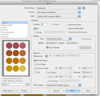
- May want to add printers marks to artwork for registration. If you use it to colour artwork then you'll get 100% CMYK- uses a lot of ink. Also, for small text if allignment is out slightly won't be a crisp image, will get a muddy print.
Ready to add new swatches:
- Use colour palette/CMYK sliders to mix colours. Specify % of each process inks.
- Should be 'Process colour'.
- Can rename swatch, however, more useful as ink percentages.
Can also create directly from swatches palette:
- Quicker this way.
Helpful to prepare a new colour palette if specific colours are known for design job.
Can change to small list view instead of thumbnail view. Gives more information. More helpful for a graphic designer.
Lets you know whether a colour is CMYK- will therefore print. Good to know as you go. To edit, double click and change percentages.
Choose add used colours so that if an existing design needs rectifying but still need old and new colours you will have a useful colour palette:
Two different types of swatches. Gray box means 'global' is checked and without means it is unchecked. This means that you have the option to control that whole colour within the design, rather than having to change it piece by piece. Edit the colour by double clicking the swatch and sliding the percentages.
Select the swatch you want, then click on 'colour' at the top of the toolbar. With a non global colour you'll get CMYK. With a global colour you'll get one slider that allows you to change the tint:
Able to add different tints of the same colour to the colour palette for a more indepth efficient colour scheme.
By editing one of the tints on the swatch palette the rest of the tints change in correspondence.
SPOT COLOUR:
- A colour that can't be printed with CMYK.
- During a print process a spot colour is a colour that isn't printed CMYK.
- Spot colour requires its own printing plate.
For example. fluorescent colours can't be made up of CMYK. they are ready made colours- spot colours.
- If you are asked to design something using two colours then the production costs will be cheaper because only two plates are used rather than 4- CMYK.
- Spot colour can also make it more pricey, with additional plates to CMYK.
- Would be used for BRANDING.
Consistency within branding. If CMYK was used there could still be different variations because of how much this logo is used/printed it is unreliable. However, with spot colours only two plates are needed. You can refer to Pantone for a consistent colour.
So, within Illustrator, adding spot colours from Pantone to the swatch palette:
Each Pantone represents the physical book.
Refers to stock and colour library.
Click on colour library, pops up next to swatches,
E.g. 'Solid Coated:
Click on small list view, gives the reference no. Link between reference book and swatches available. To make it quicker to find spot colour, choose 'find field'.
Search the colour you want/the colour the client has given you then just click it to add to main colour palette.
Create different tints of the spot colour- this means that for a two colour print job you will still be using two colours, but gives more variation and spectrum for the design.
- DO NOT change name of spot colour- this is the only reference for the printer as to what colour you are using.
(There is no way to print spot colours accurately within college).
The circle within the square depicts that it is a spot colour.
Printing:
Click on output, and separations,
Each of the positives/printing plate/silkscreen come up from this.
If you decide you don't want to use print plates and go back to CMYK then click this:
SAVING SWATCH LIBRARY:
AI means it will be available from any AdobeIllustrator programme. So save as AI.
This means it is saved in the swatch library within the HomeFolder
It resets when you open a new document so enter the menu and go down to open swatch library and find the saved swatch from before.
You can also save swatch library as ASE, which means you can use it within other Adobe suites, i.e. from illustrator to photoshop. Follow the same instructions as before, you will lose some swatches including patterns and gradient.
Definitions:
Process colours:
A process colour is printed using a combination of the four standard process inks: CMYK. By default, illustrator defines new swatches as process colours.
Global Process Colours:
A global colour is automatically updated throughout your artwork when you edit it. All spot colours are global or local. You can identify global colour swatches by the global colour icon (when the panel is in list view) or a triangle in the lower corner ( when the panel is in thumbnail view).
Spot colour:
A spot colour is a premixed ink that is used instead of, or in addition to, CMYK process inks. You can identify spot colour swatches by the spot colour icon (when the panel is in list view) or a dot ion the lower corner (when the panel is in thumbnail view).


