Monday, 28 February 2011

Design is about Doing. HOW Design. Initial Research


The first step was to highlight all the obvious opposites that exist; hot/ cold; heavy/ light; shiny/ matt etc.  I then went on to look into other avenues of opposites.  For example I thought about a more physical form of opposite i.e. a transvestite. -an living oxymoron.  Then, onto more conceptual, i.e. words that mean more than one thing.  However, I realised this was not entirely an opposite so when it came to decision time I didn't know what to choose at all.  So, I decided to base my decision on the opposite I looked at first on the sheet above:
Proposal:


Definitely not the most original start.  However, i'm confident that it can be made into something more.  There is definitely potential, I just have to be careful not to be cliche about it.  Below: I've  written down everything that (to me) has the potential to be tame and wild.  For example a pet such as a dog can be tame, yet a wolf can also be wild when absent from humans in its' life.  


It would be wise to choose a select few and work on them given that we only have a week for this brief.  The four that interest me the most are: animals// hair// Jeykll and Hyde// sound.  I also think it would be an interesting and refreshing angle to pick one that I haven't initially found potential with.  So, using the same tactic as before I chose the first that I looked at and came up with 'wires'.  For now my focus will be based around these five areas:
Animals/
Hair/
Jekyll and Hyde/
Sound/
Wires.



Tuesday, 15 February 2011

Collection 100, Leaflet Design- promotion.

From my book binding workshop I have found that a simple concertina fold will work well for this leaflet design given that my main aim is to have two sides; one that highlights how much change students have in their bags, and one that shows what could be bought with that money to 'make a difference'.


Using A4 format folded twice will give a ratio that reflects my existing poster designs.  It will be large enough for the viewer to comfortably be able to read the text, yet small enough to not impose.


Title page:


I think this play on words makes for a good slogan.  At first I was thinking 'A little change can make a big change'.  However, after asking numerous people which they preferred it came that the first was more "humane"- it was as if one of their peers was talking to them.  They could "relate" to that more colloquial phrasing.  


I think the small text and left alignment gives a simple look that I want to convey. 
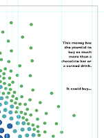
My initial infographic on change within bags would work well across one side of my leaflet, slowly revealing information as the viewer opens it:


- To begin with the viewer would just see the red and pink dots, then keep opening up to more.  They would be intrigued as to what they meant.  I think text is required here.


Here I have begin using the grid technique to make sure there is consistency to the layout of the design.  I did this on Illustrator using the 'guides' then 'locking' them to make sure they didn't move whilst I continued on my design.  
Below is a variation of the right sided text.  I think that lowering the last sentence and adding and ellipsis encourages the reader to turn over, implying there is more to come.


This side of the leaflet works well open as a whole.  I think this would also work well as a poster.
However, much like the poster I think it needs a key to further explain what the imagery means.


Now,
What could be bought:
I think that again, one of my existing infographic designs would work well- if the viewer has already seen the poster they will make the visual connection between the matching imagery and create a stronger association.
For my third poster design I used a more regimented triangular shape.  This will give more consistency to the design given that the design above is also triangular.
The fact that there is less space means that it would have to be more condensed.  So it makes sense to use this design:


Monday, 14 February 2011

Photoshop Brief, Postcard designs Cont.


Here I have used the 'Elliptical marquee tool' to create circles.  I then desaturated them to create two monochrome circles.


The last design above is a filter from the 'render' option named 'clouds'.  In my opinion this is a tacky effect- it makes the design less sharp and more ambiguous- it does not fit in with the consistency of my designs.


Above is the evolution of this specific design.  Again, i'm following the "retro" brown/orange hue look.  And below I have experimented with the 'selective colour' tool and changed the hues within the red in the design.  


Above is a variation of another of my designs.  Here I have duplicated the image layer twice and lowered the opacity on each to give a feel of movement.

Photoshop Brief, Postcard designs.

To begin with i'll just be experimenting with what I know, working out what looks best.


The image above was too dark so I changed the brightness and contrast on the 'image' then 'adjustments' bar.  Once the background was lighter I selected just the lid so that I could experiment with duplicating the image- as shown above on 'Layer 1'.


Above is the image repeated in a pattern.  Here I have also created a new orange layer and played about with the 'merging' options.  This specific option makes the orange more vibrant.  I think the vibrant orange against the blank white communicates the colour orange well, however, I think the pattern is too simple.  Perhaps either just two lids or double this amount would both work more successfully?


After completing this design i've realised the slight 70's look it holds.  This is because of the deep brown hue of orange, giving it the 'retro' feel.
I'm going to continue to experiment with this pen lid patterned design.


Here I have selected the lid as its own object so that I can singularly select it; duplicate it etc.


Above I have duplicated the pattern and changed their angle and size.  And have once again changed the merging option to 'darken'.