Thursday, 17 March 2011

InDesign induction

It is important to set up your document correctly before you even begin with your designs, therefore we spent a lot of time sorting out things such as 'bleed', 'margins', 'columns' etc.  


First we set up the page size as specified in the brief.  The page size is the size of the design printed and cut down.
If the pages are going to be opposite to each other then you must select 'Facing pages' as when the document loads they will be together on one artboard rather than separate, making it easier to gauge how everything will fit together.


Next we looked at 'bleed'.  This is the red line on the outside of the document of which the general measurement is 3mm.  The reason to do this is so that when you print off the final resolution, the ink prints over the desired size sot there are no white boarders.
Above is a document ready to design with.  I have set a gutter in between the columns prior to opening the document.  These essentially set up a grid system for the document, making it easier to design and allign.
Once the document was opened we then began experimenting with type and layout.  To do this we selected the text tool and filled the boxes with 'placeholder text' to get an idea of what the article will look like once finished.

Week 2
 This week we looked more closely into  specific magazine design. 


The first issue encountered was the page layout on inDesign- we found that if you entered '2' as the number of pages then they would not sit as the same level and would therefore be difficult to work with.  If you enter '3' as the number of pages then there would be a single page at the top of the artboard with two attatched below.  This means that when you enter your preferences on columns, guttering, indents etc it will apply to all three pges.


The plan for today was to try and emulate as successfully as possible an existing magazine layout.  We had to measure the size of the images, the margins, the text etc to get an accurate/exact representation of the article.

Saturday, 12 March 2011

Visual Language, Colour theory


My wardrobe colour theory.

Digital Photography, further images.

Investigation into the colour orange through photography studio resources.


I experimented with changing coloured gels to see how it would effect the orange.  In most cases it is still clearly orange with a slight blue or green hue to it.  However, sometimes when increasing the brightness and using a red gel the whole image and object become red, for example:

Above is an example of my experimentation with 'mood lighting', maximising the 'macro' setting on the SLR.  The orange is heightened here because the lighting makes the colour more vivid.  The depth of field is created by the use of the macro setting- the contrast between detail and blurryness gives is a dreamlike quality.

Friday, 11 March 2011

Communication is a Virus, initial ideas.

After thinking about how ideas and information spreads, we realised that from our research most of the time it's through word of mouth- unless you have a lot of money for big time advertising.  Essentially this is 'the domino effect' - you tell two people, all of those people tell two people- quickly the number multiplies.  This is the general principle we are going to be using throughout the project.


Above are the final board designs for our pitch on friday outlining the concept, the content and our method of delivery.


Thursday, 10 March 2011

Design is about doing

Experimenting with different strokes and pointsizes, therefore changing its' emphasis.


After the final crit, I found that my feedback was positive, yet only once I had explained my concept.  The idea that the soundwaves are the typeface- they show words and letters in a different format than what people are used to- like brail.
There was a debate about whether this worked as a typeface or not.  So, below I have attempted to create a typeface using soundwaves:


I think the last works best.  The typeface is created within the soundwaves, creating an interesting contrast in textures in and around this area.  However, with the other typeface, the soundwaves are the words, something which has been done many times before.  The idea behind the one above is that the words that you can recognise are made up from the soundwaves that represent them.

Wednesday, 9 March 2011

Design is about Doing, Development.


To bring this idea back to the brief I started looking into different forms that type can come in.  For example, brail.  Soundwaves can be a form off communication- words.  I am arguing that by saying these words, recording them, then designing them visually, means that this works as a concept in the sense that visual soundwaves can essentially be type.
After thoroughly researching into possible programs that would record sound visually I decided the best one for the job was 'Audacity'.  I decided this because it is simple enough for me to use whilst still challenging me- keeping me interested.  Once downloaded I then used the microphone within my Laptop to record myself saying the phrases below: 
See the sound:


Listen to the silence:


Look at the noise:


Once the sounds above were recorded I placed them into Illustrator and 'live traced' them to begin manipulation.  Below are a few quick designs working with the phrase in both formats.


Above are a few versions of one of the phrases using different typefaces- the aim of this was to guage what works with the words.  Unfortunately it isn't totally clear to me what will work and what won't at this stage, the plan now is to carry on with designs and experiment further with the typeface and layout of the posters.
Out of the three phrases I feel that 'Listen to the silence' is the most relative to the brief as it is a contradiction within itself- an opposite.  However, my concept for this specific poster is that when you actually do listen to the silence in quiet areas you realise how much noise is going on around you.

Listen to the silence:


The program enables you to zoom in on the sound recordings, so here I have zoomed in closely on the 'Listen to the silence' recording.  For this recording I have gone to quiet areas and recorded with audacity through my internal microphone, picking up whatever sound there is around me-  forcing the question that no where is ever really silent- the phrase is used very loosely within society.
Below are the soundwaves in illustrator:


Tuesday, 8 March 2011

Visual Language, 'What is a Line'.


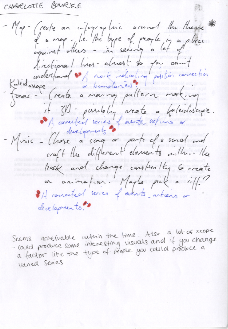
We had to decide on three of the ten ideas we had come up with.  My three included those above.  My favourite idea is the last- visualisation of sound.  This would be interesting to explore further from my last concept within the 'Design is Doing' competition brief, as it was a brief that I thoroughly enjoyed.  In the sense of 'taking the concept further' my idea is to create a 3-D sculpture that has stripped down a specific piece of music to involve separately the different elements within this music, i.e.vocals, bass, beat etc.  This may not be what I end up doing but I feel such a hand crafted technique works well with this exploratory brief- the brief allows me to experiment, so I should take advantage of this by trying something new.