Showing posts with label Identity. Show all posts

Monday, 29 October 2012

Elements: economical colour application


Smokin Raps, '86.


I saw this in 'The book of Hip Hop cover art' and 
had a slight brainwave on the colour scheme 
application to the event.  

Because we are riso printing, we want to use as few
colours as possible to keep costs down.

Using this type of imagery to inform our economical
decisions within the design process we will create
an identity that will truthfully reflect the visual 
culture of hHip Hop, whilst successfully answering our
costing issues.

I've had a few ideas to do with application already:

-  Promo


4D design incorporating colour, slowly revealing 
context.  To exploit this we would need to do our
research into busy streets where the majority of 
our audience would frequent.

By printing more copies of single colour, and 
significantly less of the four colour posters we
would save a chunk of money from our budget.

-  Wayfinding:
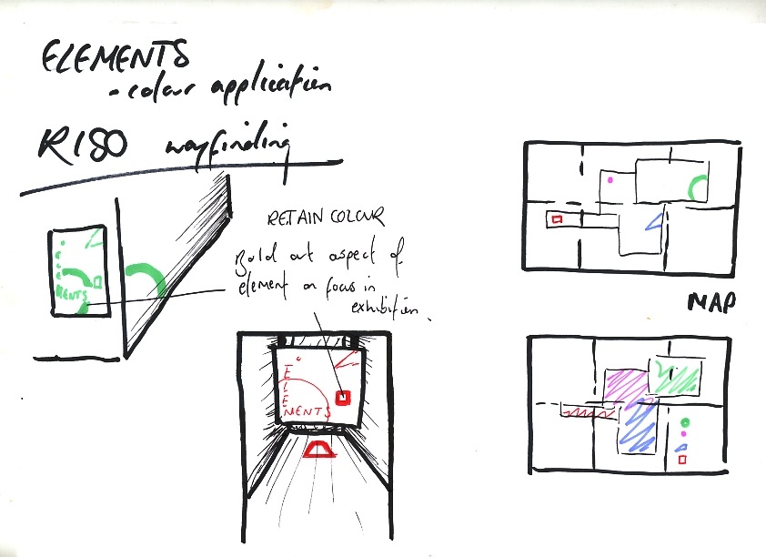

The print process is the main area driving the 
design decisions.


Friday, 26 October 2012

Elements: logo evolution


Post - crit with Andy on Wednesday, amendments; 
considerations & experimentation.

Andy's point was that the type was too jarring against the logo.  
The serif looked almost decorative against the geometric shapes 
of the elements.  He proposed we look at more Bauhaus 
influenced typefaces that would marry respectfully with the
surrounding visuals.

Anti - design.  Justification.  So, no!


Final logo concept.
We tried to take a more structured direction, but all 
it did was reiterate the fact that this was the correct
aesthetic to go for.

talk about how it is relevant.  i.e .juxtaposition 
of geometric and shape etc 

Friday, 19 October 2012

SPUR, promo poster

After seeing a promotional poster for the launch night 
of the publication uploaded onto the folder we were all 
working from I got very confused and called a meeting.

The visual inconsistencies from layout of the content to 
promotional work were vast.  

My role is to now work alongside another designer with 
everything that isn't the layout of the content.  This is not
what I would have chosen if I knew straight off, but there 
is nothing I can do about it now.

The piece that brought all of this to my attention was:


Seeing this made me ask quite a few questions.  One was
what exactly it is that they want me to do.  And the next
was, 'is there enough communication?'.  I thought this 
because of typefaces.  The type doesn't at all reflect the
tone of the magazine and content as a whole.

We all decided that based on the whole identity, Gill
Sans and Times would work best together to successfully
communicate the knowledgeable; classic; contemporary 
tone they are going for.  

[INSERT ANNOTATED PRINT OUT]

Looking back at the initial layout concepts I had come up 
with, this poster really does not reflect that.  However, I 
couldn't persuade the creators that they should go in another 
direction to keep visual consistency, so, we opted for an
improvement on the existing poster.


We're all learning to work with one another and learning
from each other.  It's hard but it is very necessary.

Wednesday, 17 October 2012

Proposal, 'Jukebox'


Proposed logo; identity and flyer for new night at HiFi:
'Jukebox'.

The night is live.  It's about celebrating local to international
level artists with different skillsets in the musical industry.

The event kicks off with a set from a local live band, then
onto a well known national artist, then moves late into the
night with quality tunage from reputable dj's.  There is a 
focus on the quality of the music.  It has to be good.

So below is my proposal, sent off before the deadline.


Sunday, 20 November 2011

In Context.


In context.  Promotion and Identity for the brand.  Visualising within a real environment is important.  It means you are able to see if your designs work in different scales and environments.  I think here the large scale poster works very well within that context.  The simplicity and impact of the chosen colours makes the poster pop out against the others (of which also use monochrome colour scheme).
The poster would benefit from a slow reveal promo.  -You first see the imagery everywhere, stickers, posters, mailshots etc, and after people have got talking about the image you send the next area of information, for example, I could just put a date and a location i.e.the shop and have a grand opening.

I think the Photoshop images within an actual clothing store work well.  The area suits the audience I am going for along with the environment I want my tees to exist in.  Wall Vinyls look very interesting and are something I should definitely consider taking forward.