Showing posts with label ELEMENTS. Show all posts

Tuesday, 4 December 2012

Stock considerations

If we can get the colour of the stock right.  It's all 
going to be better than good.  We just have to 
remember to keep with a colour scheme.  This has to be 
decided before the promo goes out, before the wayfinding 
gets sent to print etc.


Sunday, 2 December 2012

Limitations, Economics: Evolution of design

After visiting Catalogue to talk to them about the 
possibilities of printing through Riso, our final 
promotional designs have changed somewhat.


Where our designs started focusing more on imagery and 
manipulation of it's visibility through experimentation 
with opacity, we found from Catalogue that this would 
not translate to printed matter.  Which was really annoying 
because of how happy we were with the designs.  BUT, this
 is how it is, so for now, our designs have regressed back to 
experimentation with stock to communicate our ideas.  


The design will constantly be changing after deadline 
because it is a live brief for late March 2013.


Wednesday, 7 November 2012

Elements: Promo > Progress


We made a lot of progress today.  

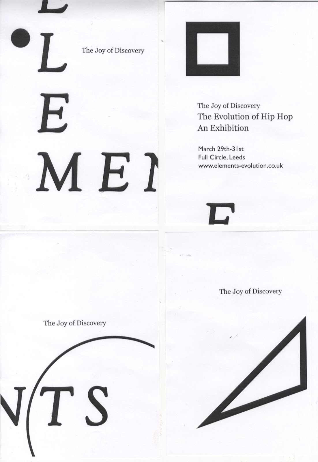
When misaligning the cut down a5's on the rounded wall 
I suggested a boarder- Yaf then agreed for reasons much 
more relevant than my own.  We came to the conclusion 
that by adding a boarder to the A3 artwork it would help it 
pop a little more because of only using one colour plus stock.  

We then realised that it would help the viewer understand how 
the cut-down a5 versions are supposed to originally be arranged 
by the angle of the boarder.  Showing that the movement of hip hop 
is only complete when all four elements are pieced together- much 
like the exhibition.


Tuesday, 6 November 2012

Elements exhibition- I just got an idea

Inspired by this luvlee piece of work right eere:


Its important to remember the type of audience we
are aiming this exhibition at.  They are more likely to 
understand and appreciate the joy of discovering the
lyricism of emceeing and rapping with an audio / visual
combo.

This idea solves that problem.  Now to design & mock - up.


Friday, 2 November 2012

Elements: Exhibition promotion

Once again, economical thinking:
                                                                                                                                     

Make sure there is a single element in each of the four posters.
So, because to save money we will be cutting the A2 posters
down to A4, we need to make sure there are no elements
(each of the four shapes) overlapping these areas.

By assigning each individual element to a specific A4 area of 
the A2 poster it puts the emphasis on the elements.  The fact that
the message isn't communicated clearly individually is exactly 
what we want to achieve.  Hip hop is only hip hop when
all the elements are together.  Individually they are all beautiful,
but only when they are together do they create this powerful
movement.  This is what has inspired us for the promo concept. 


A closer & more informative look at the application:


Printed, proofed & evaluated.
- a lot of rectification needed:


d

Monday, 29 October 2012

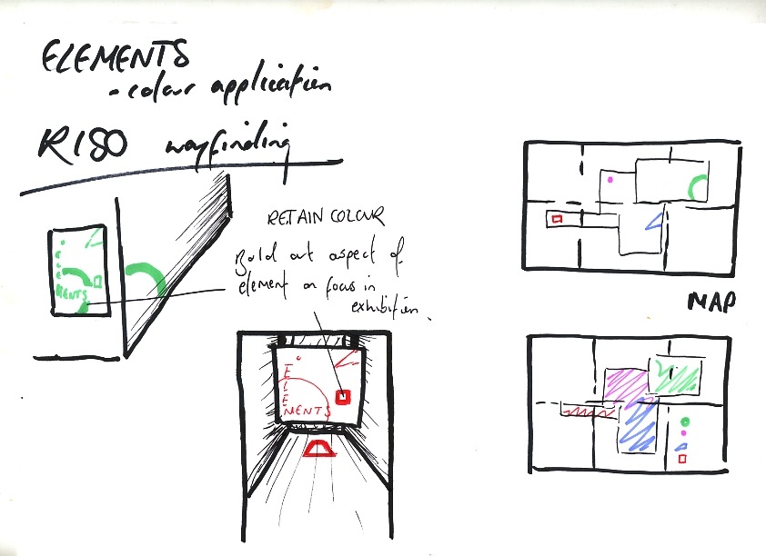
Elements: economical colour application


Smokin Raps, '86.


I saw this in 'The book of Hip Hop cover art' and 
had a slight brainwave on the colour scheme 
application to the event.  

Because we are riso printing, we want to use as few
colours as possible to keep costs down.

Using this type of imagery to inform our economical
decisions within the design process we will create
an identity that will truthfully reflect the visual 
culture of hHip Hop, whilst successfully answering our
costing issues.

I've had a few ideas to do with application already:

-  Promo


4D design incorporating colour, slowly revealing 
context.  To exploit this we would need to do our
research into busy streets where the majority of 
our audience would frequent.

By printing more copies of single colour, and 
significantly less of the four colour posters we
would save a chunk of money from our budget.

-  Wayfinding:


The print process is the main area driving the 
design decisions.