Showing posts with label Design Production. Show all posts

Tuesday, 11 December 2012

Collate; organise; reflect; READ

To be handed out at each talk to anyone who 
has not yet received one.  The readers can then
collage their essays and annotations in one 
place to take home, bring to talks.
Everything in one place and still visual. 


THE POINT OF THIS BRIEF IS NOT TO DESIGN SOMETHING THAT LOOKS LIKE A FAD CREATION.  IT IS TO CREATIVELY AND EFFECTIVELY SOLVE THE PROBLEMS THE BRIEF HAS SET, AND, OVER THE DESIGN PROCESS, CREATED.


Ease of transporting.


Thursday, 6 December 2012

Design Development, Relativity of design decisions

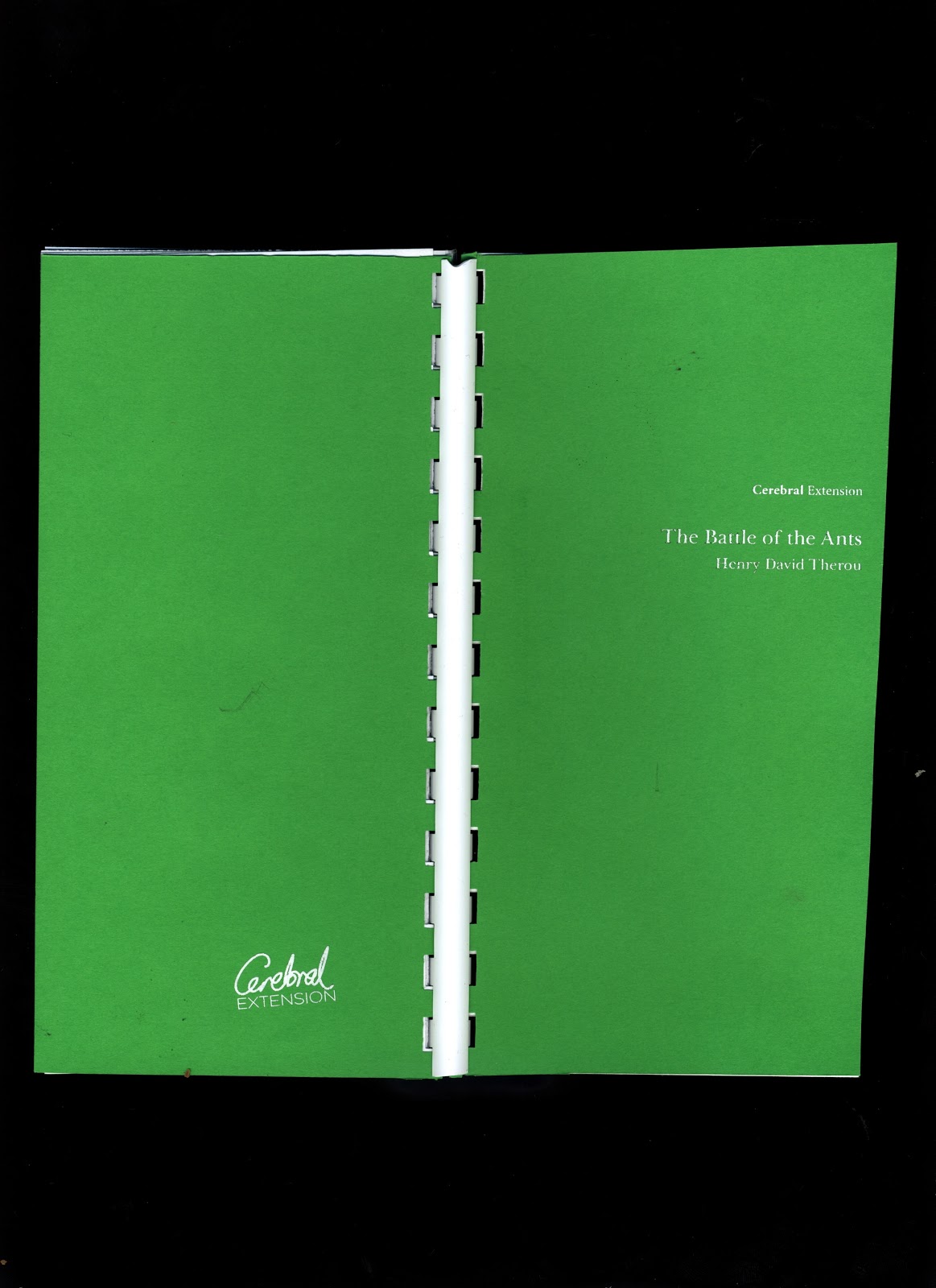
RINGBOUND?

WHY YES.
ISN'T THAT AN OUTDATED AND AESTHETICALLY RANK APPROACH TO PUBLISHING AND BINDING?
NO, NOT AT ALL, here is why:

This brief is all about answering the problem of how
different people read.  This could also be recognising
the fact that a lot of people have to take down notes
and information when learning.


This functional design looks slightly incorrect aesthetically,
one of my next problems is figuring out how I can design
to make this bind visually pleasing and accessible to the audience,

BIND IS RELEVANT


The perfect answer to the problem of annotating
the text:


Experimentation with framing of the spreads 
from stock shape and colour


Tuesday, 4 December 2012

Stock considerations

If we can get the colour of the stock right.  It's all 
going to be better than good.  We just have to 
remember to keep with a colour scheme.  This has to be 
decided before the promo goes out, before the wayfinding 
gets sent to print etc.


Sunday, 2 December 2012

Limitations, Economics: Evolution of design

After visiting Catalogue to talk to them about the 
possibilities of printing through Riso, our final 
promotional designs have changed somewhat.


Where our designs started focusing more on imagery and 
manipulation of it's visibility through experimentation 
with opacity, we found from Catalogue that this would 
not translate to printed matter.  Which was really annoying 
because of how happy we were with the designs.  BUT, this
 is how it is, so for now, our designs have regressed back to 
experimentation with stock to communicate our ideas.  


The design will constantly be changing after deadline 
because it is a live brief for late March 2013.


Friday, 9 November 2012

Vinyl designs

Final vinyl designs.

We felt that a while vinyl would look really 

clean against the rest of the colour scheme. 
It is bold enough to stand out, yet comfortable 
enough to fit in and work in congruence with 
the rest of the design.


Below, the 'Bandcamp' site where fans can listen
online.  the format has become rectangular to fit 
the screen dimensions, whilst not manipulating 
the shape of the ice or type.


Wednesday, 7 November 2012

Range expansion

 These t shirt designs are designed to sell.  
With the audience in mind, a more abstract, 
ambiguous approach would be appreciated.  
The fact that the band sing about intelligent 
things and want conceptual artwork means 
that the audience will feel rewarded when 
they understand something that not everyone 
understands- a kind of "in-joke" between the 
band and the fans that brings the two closer 
together.  

This relationship is important for 
more independent bands and so this is my 
reasoning for choosing the lower design as 
the main tee for merch.


Friday, 2 November 2012

Photographs, art direction


DESIGN IS FUN

Axe   &   saw   in -hand. 


Some select images from the photoshoot.
The bright colour scheme, against the jarring 
shapes are supposed to stand out strong.  Look 
confident and independent.  It is supposed to 
send the message that this band are serious and 
there is a lot more to them than you would initially 
presume.  The process was fun and extremely 
rewarding.  There is a lot of scope here to develop 
our visuals further into artwork for the band.