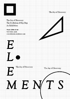
Once again, economical thinking:
Make sure there is a single element in each of the four posters.
So, because to save money we will be cutting the A2 posters
down to A4, we need to make sure there are no elements
(each of the four shapes) overlapping these areas.
By assigning each individual element to a specific A4 area of
the A2 poster it puts the emphasis on the elements. The fact that
the message isn't communicated clearly individually is exactly
what we want to achieve. Hip hop is only hip hop when
all the elements are together. Individually they are all beautiful,
but only when they are together do they create this powerful
movement. This is what has inspired us for the promo concept.
A closer & more informative look at the application:
Printed, proofed & evaluated.
- a lot of rectification needed:

d


No comments:
Post a Comment