Friday, 11 February 2011
Collection 100, final resolution posters.
I took the brief live by placing the posters around college and student accommodation. I felt that this was relevant because my audience is students... with bags. They received some attention from people and when I asked what drew them to the piece they said 'The bright colours and high contrast'.
Below are my final designs for the infographic posters:
Monday, 7 February 2011
Initial Ideas, Book Works
'A's within scaffolding.'
This idea shows the construction of an 'a' using scaffolding. The reason I chose scaffolding to begin with is because the letterform 'a' (from what I have seen) is always present.
So this basically shows an image of an a. Once they begin turning the pages they see the anatomy of the 'a' using the existing image cut-up.
I'm not sure this idea of construction is working. It is interactive, but not visually engaging enough. I think that a more simplistic look would be successful in appealing to a wider audience.
-not interesting enough.
So rather than focusing on the letterform 'A', I have decided to check out words of interest that begin with 'a'.
I found this website. It is fairly informative.
Some of my personal favourites include:
(one to note: 'allantoid')
| ai | three-toed sloth |
| agrostology | science or study of grasses |
| affricate | consonant that begins as a plosive and ends as a fricative |
| adeciduate | evergreen; coniferous |
| actinism | action of solar radiation causing chemical change |
| acipenser | sturgeon |
| autecology | study of ecology of one species |
| asperge | to sprinkle |
| apodal | lacking feet |
| allantoid | shaped like a sausage |
| amanous | lacking hands |
Visual Language brief: 'book works'
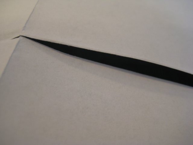
This brief revolves around the 'Hot dog fold'.
So first I was trying to get to grips with its general folded design.
To begin with you fold the (this is A4 but other sizes also work) paper in half then in half again. You then fold in the opposite direction once. After this you cut down the centre of the page along the fold, leaving once folds height at the top and bottom. Hold the paper landscape and push together so that the fold in the centre pushes to the back, it will now look like an A5 sheet of paper- fold it from top to bottom and it is complete. There should be 8 leaves including the front and back.
Collection 100, infographic posters
These are my current designs for my promotional posters. They raise awareness of the amount of money people have.
Below is an alternate design I have created which also works well, however, when placing the three posters in order and asking people which one they thought helped it flow everyone said the rectangular shape above.
I thought that this square shape would fit the general theme of shapes within these designs. However, it seems that the slight variation makes people focus on the top left image moreso than the one above.
Thursday, 3 February 2011
Infographics experimentation, Collection 100: Cont.
A triptych?
Perhaps 3 infographics pieces which work solely together.
OR
Three that work together and at the same time are successful in communicating standing alone.
I.e.
If all three have a small key at the bottom of the page then they will work alone. But, to me, the shapes and weighting of these three designs work visually together. I think the key is to frame the middle piece with two heavily weighted shapes at either side. This is coming from my original infographic and the weight of the circle:
My next design shows the total amount (unlike the piece above which represents the total amount of each type of coin). In this case it is simplicity.
Perhaps 3 infographics pieces which work solely together.
OR
Three that work together and at the same time are successful in communicating standing alone.
I.e.
If all three have a small key at the bottom of the page then they will work alone. But, to me, the shapes and weighting of these three designs work visually together. I think the key is to frame the middle piece with two heavily weighted shapes at either side. This is coming from my original infographic and the weight of the circle:
My next design shows the total amount (unlike the piece above which represents the total amount of each type of coin). In this case it is simplicity.
Collection 100, Charity promotion?
After finding that the majority of people spend their change on snacks and sweets, I started thinking about what else could be bought with that money.
Because most of this money has been totaled up in the bottom of their bags, unknown to them, it seems that the money could be spent on something much more useful and it wouldn't affect them.
So, giving money to charities is a good cause.
So, promotion of a charity could work well with this more 'apathetic" audience, given that they just have to check out the bottom of their bag to do a bit of good.
Check out Design Context for information on what charities could buy with this overlooked cash.
Because most of this money has been totaled up in the bottom of their bags, unknown to them, it seems that the money could be spent on something much more useful and it wouldn't affect them.
So, giving money to charities is a good cause.
So, promotion of a charity could work well with this more 'apathetic" audience, given that they just have to check out the bottom of their bag to do a bit of good.
Check out Design Context for information on what charities could buy with this overlooked cash.
Monday, 31 January 2011
Infographics experimentation, Collection 100: Cont.
This is a development from the previous infographic experimentation using the Illustrator bag trace. I think this looks more visually stimulating because it is less structured, and more like an explosion. However, it doesn't communicate as effectively as the previous piece.
- A key would help this.
This is my second attempt. I followed the idea of making the piece aesthetically interesting and colourful to communicate the information gathered. At the bottom of the piece there is a key. I thought that placing it horizontally across the bottom of the piece would frame it in a way where the viewers main attention is still on the spherical information above.
There are many different ways I can experiment with this key, for example:
This is my second attempt. I followed the idea of making the piece aesthetically interesting and colourful to communicate the information gathered. At the bottom of the piece there is a key. I thought that placing it horizontally across the bottom of the piece would frame it in a way where the viewers main attention is still on the spherical information above.
There are many different ways I can experiment with this key, for example:
Subscribe to:
Posts (Atom)