Wednesday, 12 December 2012

OUGD301, Design Practice 3

Briefs


Module Submission


Presentation

Brief 1
The Physics House Band:  Music promotion and art direction


Brief 2
Elements: The Evolution of Hip Hop:  Event promotion


Brief 3
SPUR: Creatives of Leeds:  Publishing


Brief 4
ISTD:'Books still...?': Publishing 


Brief 5 
Jukebox, HiFi: Event promotion


Brief 6
The Wardrobe: Blue Mondays:  Event promotion


ISTD: Final images


Tuesday, 11 December 2012

Collate; organise; reflect; READ

To be handed out at each talk to anyone who 
has not yet received one.  The readers can then
collage their essays and annotations in one 
place to take home, bring to talks.
Everything in one place and still visual. 


THE POINT OF THIS BRIEF IS NOT TO DESIGN SOMETHING THAT LOOKS LIKE A FAD CREATION.  IT IS TO CREATIVELY AND EFFECTIVELY SOLVE THE PROBLEMS THE BRIEF HAS SET, AND, OVER THE DESIGN PROCESS, CREATED.


Ease of transporting.


Range.


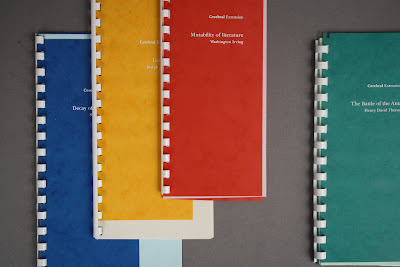
An example of the range I have created.

Much like Lyrical Extension, there are 

different categories of talks.  For example
the different formats of each booklet are
supposed to reflect the subject matter and 
type setting of the text within.  Every aspect
of design is a resolution to a problem.


Saturday, 8 December 2012

Stock consideration

ISTD:

White is too jarring to effectively read.  Noise.

Whilst the viewer is reading they need to be 
relaxed in order to successfully take in the
information, along with reflecting on it.


These pastel stocks, against the tacky 90's 
textured bright primary colours would look a lot 
more fitting against the white ringbind and logo, 
rather than the white stock.  Too much white.


...doing some designing

It is a poster!
/ invitation.

I thought it would be an interesting angle to 
place the full excerpt that would be included at 
the talk into the poster.  Along with a quote and 
a laconic statement.  Again, to appeal to all 
different types of readers.  The poster can then attract 
different lengths of attention, so all the information 
will not be received by everyone.  

This doesn't matter because all the information is there.


Thursday, 6 December 2012

Design Development, Relativity of design decisions

RINGBOUND?

WHY YES.
ISN'T THAT AN OUTDATED AND AESTHETICALLY RANK APPROACH TO PUBLISHING AND BINDING?
NO, NOT AT ALL, here is why:

This brief is all about answering the problem of how
different people read.  This could also be recognising
the fact that a lot of people have to take down notes
and information when learning.


This functional design looks slightly incorrect aesthetically,
one of my next problems is figuring out how I can design
to make this bind visually pleasing and accessible to the audience,

BIND IS RELEVANT


The perfect answer to the problem of annotating
the text:


Experimentation with framing of the spreads 
from stock shape and colour


Tuesday, 4 December 2012

Stock considerations

If we can get the colour of the stock right.  It's all 
going to be better than good.  We just have to 
remember to keep with a colour scheme.  This has to be 
decided before the promo goes out, before the wayfinding 
gets sent to print etc.