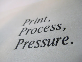
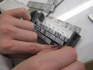
Today we went down to Vernon St to compile letterpress and woodblock designs for our postcards. However, things tend to take a lot longer than first imagined- as with everything in this project. Below is what we came up with:
To begin with we were playing around with existing letterforms within the print studio, we wanted to see if words would work well against an image. I then inked up the logo and began printing. The results were better than we had both imaged. The strong colours work well with the simple design on simple stock:
The image above is an example of how messy things can get when printing. There is no way to keep everything clean when using your hands- ink coated hands. Later on I was shown how to stop this situation. You cut clean pieces of paper, small enough for your fingers and use them to protect the stock against the ink.
Talk about pressure.
Later on in the day when Roger was free he helped us with setting up our letterpress.
We chose Times Italic to keep visual consistency within the whole postcard package. The pointsize was kept small so that we could layer it up over one of our screenprints without confusion, for example:
We didn't get time that day to finish out letterpress off so we came in the next day to print, results are as follows:
You can really see from woodblock and letterpress that these processes just wouldn't work without pressure. It really is the main aspect of the print processes, therefore solidifying our decision on 'the three p's'.
We experimented with changing the amount of pressure we were putting on the press by swapping trace for newsprint, newsprint for cartridge paper and so on. This changes the printed result slightly. The first print is more cracked and less solid, and, depending on what resolution you're looking for this could work well. However, our aim was a crisp, clean print, and we obtained this on good quality trace stock and more pressure.
Mine and Sadies' favourite piece would the the second. We both thought that the words were clear to read, with the design being stimulating at the same time. Originally this specific screenprint was a case of terrible misallignment, but with trace over it it just works. The message is put across in words, showing one of the print processes at the same time, whilst incorporating consistent visual designs. Our message is still clear.


