Tuesday, 28 September 2010

ALPHABET SOUP


However, it would be hard to make the idea below as quality as i would like because the details of the brief state that you need a 'set, series or sequence of ten letterforms' which means i would be limited with outcomes.

The 'flip book' idea above gives me that leverage I need to be able to produce ten separate letterforms that also work together as a sequence in an interactive way.


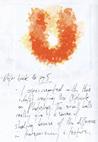
This is some of my experimental work using existing letterforms.  I thought that multiplying the letter then modifying its transparency would give the effect of movement, like a 'motion blur'.  I think it works well, and one of the factors contributing to its success, in my opinion, would be their texture- a busy texture just gets even more complicated once multiplied.  I think that when you are trying to make something 2 dimensional and static look as if it is moving, a complicated texture emphasises it because it mirrors the whole idea of movement.  To get scientific about it, when particles get hot they shake violently and i think that the 'U' above depicts this.


All of these images are scanned in from my current sketchbook.  The image above includes the definition of 'Shake', then its synonyms.  I did this to get me thinking of the connotations of the word and general ideas around that.

Monday, 27 September 2010

Final Piece- NAP MAP


Above are the front, inner and back final designs for the map.  As you can see they are very simple, which fits the look we were going for all the way through.  We chose to print onto brown paper to mirror the hand crafted look and to give it a overall organic feel.  

Friday, 24 September 2010

Zzz


NAP MAP- FRONT- logo, title etc.


FRONT DESIGN

-Logos and titles


This is the type we have chosen.  It is hand rendered and has the playful, imperfect look of the illustrated map.  This keeps the theme consistent which creates a more strong overall look to the leaflet.


Above are all the types and logo's we played around with.  In the end we opted for the hand rendered approach as it looks more personal so makes a connection to the person viewing it.


Above is our layout design for the Nap Map leaflet.  We chose the front and back squares to be simple so that the viewer doesn't get overloaded with information and put off using the map altogether.  The simplicity of the two reflects the whole theme and sets the tone straight away.  we chose to include some nap facts on the inner to reinforce the positivity of actually having a nap in the day time.  

-This reinforces further our whole concept of having a nap and showing students 'How to survive the day in college' because of the facts behind it.

Thursday, 23 September 2010

NAP MAP- Compact.


So next we expanded on our research to make it compact through looking at different types of paper folds.  Here is the 'waterbomb bucket' method of folding.  It folds straight into a square- quarter its original size.  This enables us to translate the map in a larger scale within the fold and still have a simple front that reflects the simplicity of the whole design.  It also allows us to include important information such as facts to do with napping that reinforce the whole concept of having a nap, along with 'Napline' contact details that can all be neatly concealed once the leaflet is folded.

'How to...' NAP MAP- Map research


Above is a simplified version of the most relevant area of the map.  We chose not to include the right side of the map because there were very few napping areas so there was alot of wasted space where we could possibly include something more important.  To the left is a map found in the 'You Are Here' book  from one of my previous posts.  It has inspired our illustrative and simple look.  We thought that by hand rendering the map it would give a more personalised feel to the new students.  Also, it was necessary for the map to be as simple as possible because we had to take into account that the person reading it would be very tired and not able to take in much information.  The coloured rooms have been done with watercolour to give it a messy look.  The same goes for the library map above.


COLOUR SCHEME:


Above are a number of colour schemes available to us that we think are appropriate.  Most are calming colours that reflect how the person using it wants to feel.  Others are navy blues that have connotations of darkness and night when people usually sleep.


So here we have physically gone through the First Floor marking where the most 'nappable' areas are.  They are measured from yellow to purple to navy- navy being the most desperate napper.  

This is a map of the library, which we are going to include in the leaflet because it is arguably the most 'nappable' area within the college.

This is the First floor of Leeds College of Art.  We all thought that it would be the most relevant floor to base our map because it is aimed at us as students and our department is based here.


General Map research.  Above is a pull out, which would be relevant to consider for the format because our target audience (students) need, and want, it to be small and concise.  -this format enables you to put alot more information in a small leaflet.

'How to... survive the day in college.' NAP MAP


We then identified 10 problems and a few solutions to them.  Then the main three.  And from this other groups chose our main solution- The Nap Map.


At first we came up with the idea to create a form of "survival kit" that would include things like earplugs to drown the noise out; eye drops to keep you awake; energy drinks- basically anything that would keep you awake- to 'Defy Tiredness'.

'How To...' -beginning research


'DEFYING TIREDNESS' - this was the problem we were given from the preliminary research.


-All the problems students encounter when they first begin university.


Wednesday, 22 September 2010

YOU ARE HERE- 'How to...' research


I found this book in the library today- i was trying to find some source of information that wasn't just about maps, and this book shows the more creative take artists and designers have gone for.  Good source for getting more original ideas for our map I think.

Tuesday, 21 September 2010

'Sat Nap' Research

Some information on napping- recent stuff.


It talks about 'ideal nap times' and is relevant to our current 'How to survive the day in College' group brief.

"Tiny naps are much more refreshing than people tend to realize," said Jim Horne, director of the Sleep Research Centre at Loughborough University in England. "A short nap in the afternoon will get rid of sleepiness without interfering with nighttime sleep."  Roger Rosa, a senior scientist at the National Institute for Occupational Safety and Health. "If you've lost an hour of your previous night's sleep, a nap may be just the ticket.


-so basically a nap is going to help you survive your day in college.