Monday, 12 November 2012


Friday, 9 November 2012
Vinyl designs
Final vinyl designs.
We felt that a while vinyl would look really
clean against the rest of the colour scheme.
It is bold enough to stand out, yet comfortable
enough to fit in and work in congruence with
the rest of the design.
Below, the 'Bandcamp' site where fans can listen
online. the format has become rectangular to fit
the screen dimensions, whilst not manipulating
the shape of the ice or type.


We felt that a while vinyl would look really
clean against the rest of the colour scheme.
It is bold enough to stand out, yet comfortable
enough to fit in and work in congruence with
the rest of the design.
Below, the 'Bandcamp' site where fans can listen
online. the format has become rectangular to fit
the screen dimensions, whilst not manipulating
the shape of the ice or type.


Web session
Dreamweaver: 'Industry standard' for creating websites.
First, three questions:
- What's the purpose?
- Who's it for?
- What the audience needs?
More likely when you start as a freelancer that you'll be
doing work for smaller, local businesses- make sure the design
of the site reflects this audience.
- Always make sure it is specific to your audience.
Sketch first!
HTML & CSS
John Duckett
NOT 72 DPI!
[ 96 pixels per inch ]
- new macbook pro, ipad, iphone etc use __ dpi
Only work in code view and then preview on a browser.
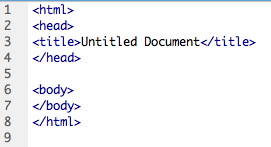
Line one s saying that from this point forward we will be
working in html.


 =
=


Before creating a site you have to 'manage content'.
To add type
&
Format
Always type in <break>


Two options for formatting layout designs.
Html
CSS
Never copy & paste code.
CSS
- allows you to format and layout in CSS document that will
link to each of the html pages.
To create external CSS document:

 - can only view css in code screen.
*only ever use 'blank page' or 'page from template'
Make notes to yourself:


specify font family:
type 'f' then return:
Link html & CSS style sheet through the head tab by:


ALT + 3 : #

First, three questions:
- What's the purpose?
- Who's it for?
- What the audience needs?
More likely when you start as a freelancer that you'll be
doing work for smaller, local businesses- make sure the design
of the site reflects this audience.
- Always make sure it is specific to your audience.
Sketch first!
HTML & CSS
John Duckett

NOT 72 DPI!
[ 96 pixels per inch ]
- new macbook pro, ipad, iphone etc use __ dpi
Only work in code view and then preview on a browser.
Line one s saying that from this point forward we will be
working in html.

Close html. That is the end of html.
Open head and close head tab isn't visible in design of the site.
There for functionality. Different language along with html,
if it can be searched in google etc.


Everything has to be in one folder.
&
Format
Always type in <break>


Two options for formatting layout designs.
Html
CSS
Never copy & paste code.
CSS
- allows you to format and layout in CSS document that will
link to each of the html pages.
To create external CSS document:


*only ever use 'blank page' or 'page from template'
Make notes to yourself:

type 'f' then return:
Link html & CSS style sheet through the head tab by:


ALT + 3 : #
Wednesday, 7 November 2012
Range expansion
These t shirt designs are designed to sell.
With the audience in mind, a more abstract,
ambiguous approach would be appreciated.
The fact that the band sing about intelligent
things and want conceptual artwork means
that the audience will feel rewarded when
they understand something that not everyone
understands- a kind of "in-joke" between the
band and the fans that brings the two closer
together.
This relationship is important for
more independent bands and so this is my
reasoning for choosing the lower design as
the main tee for merch.


With the audience in mind, a more abstract,
ambiguous approach would be appreciated.
The fact that the band sing about intelligent
things and want conceptual artwork means
that the audience will feel rewarded when
they understand something that not everyone
understands- a kind of "in-joke" between the
band and the fans that brings the two closer
together.
This relationship is important for
more independent bands and so this is my
reasoning for choosing the lower design as
the main tee for merch.


Jukebox, development
Logo decided, visuals, however, are not.


Varying designs for 'Jukebox'.
A more classic look using textures and filters on
Photoshop. The red is supposed to stand out against
the beige background. The vibrancy of the colour gives t
he design a more contemporary edge.
Elements: Promo > Progress


We made a lot of progress today.
When misaligning the cut down a5's on the rounded wall
I suggested a boarder- Yaf then agreed for reasons much
more relevant than my own. We came to the conclusion
that by adding a boarder to the A3 artwork it would help it
pop a little more because of only using one colour plus stock.
We then realised that it would help the viewer understand how
the cut-down a5 versions are supposed to originally be arranged
by the angle of the boarder. Showing that the movement of hip hop
is only complete when all four elements are pieced together- much
like the exhibition.
Subscribe to:
Posts (Atom)