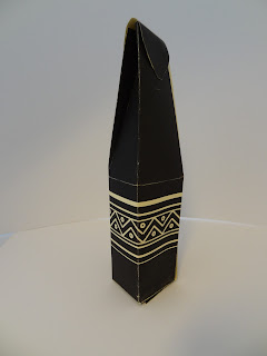
'Wrap it up' Crit:
Packaging design and exploration.
STRENGTHS:
- Use of stock.
- Use of colour.
- Pattern works well and reflects subject matter.
IMPROVEMENTS:
- Lack of consistency.
- Try something new with the packaging- reinvent it/ modify it.
- Try type.
- More information needed.


No comments:
Post a Comment