Sunday, 2 December 2012

Limitations, Economics: Evolution of design

After visiting Catalogue to talk to them about the 
possibilities of printing through Riso, our final 
promotional designs have changed somewhat.


Where our designs started focusing more on imagery and 
manipulation of it's visibility through experimentation 
with opacity, we found from Catalogue that this would 
not translate to printed matter.  Which was really annoying 
because of how happy we were with the designs.  BUT, this
 is how it is, so for now, our designs have regressed back to 
experimentation with stock to communicate our ideas.  


The design will constantly be changing after deadline 
because it is a live brief for late March 2013.


Grid system.

The key for this publication to work is part 
of the grid system.  Other aspects such as 
choice of typeface; weight; pointsize etc are
all equally as important.  However, one skill
I wanted to work on with this module was my
level of design within grids.

I need a grid system that will cater for these three

different types of reader.  This is the challenge.
Rather than only one type of person being able

to take in information I need all kinds of people 
to be able to effectively and efficiently read.


Therefore a flexible grid is a necessity.  This means

more columns for the copy to move around in.  It
also means more rules.  Rather than having a set 
few,I need to respond to the fact that it has to be 
accessible to the masses. 


As above, I can experiment with different margins, 
manipulating certain types of reader to see specific 
aspects of the grid first.

MARGINS + STOCK + COLOUR = DIRECTION


Saturday, 1 December 2012

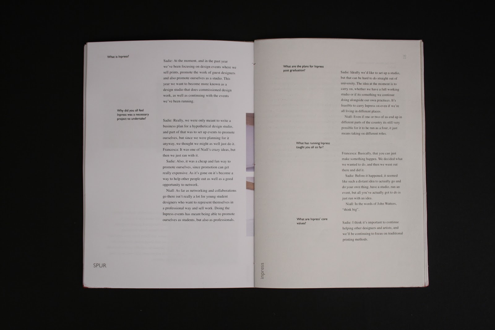
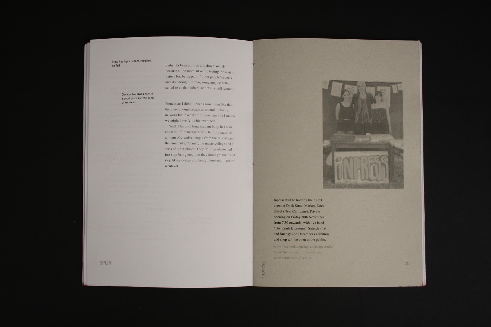
SPUR, images

Me being professional and taking some arial 
SHOTS of my work.

Emphasis is put on the spread layout and stock
options against eachother.


Thursday, 29 November 2012

Typeface selection, why?

Three different typeface selections to signify 
each type of reader.


 - Large pointsize
 - Relatively small amount of information
 - attention grabbing words used


 - Confident and past paced but not rushed.
 -

Tuesday, 27 November 2012

Print workshop

PDF files

- commercial printing 

Adobe PDF presets: 
Press quality: industry standard.
Smallest file size: client to proof, check out layout.
High quality print: laser prints- not as good as press.


Background utilities:


useful for troubleshooting errors that occur during print.

Postscript files:


enables us to create positives of screenprinting.

Acrobat pro turns postscript files into PDFs.


PDF file of re-ordered pages.


Possibilities for working with multiples:


WORK & TURN

WORK & TUMBLE