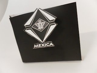
initial shopping bag net:
Initial shopping bag mock-up. It is here where I got my first idea to create a sticker for the bag closing.
Above is my experimentation with a sticker over the seal of a bag. This makes a single stock bag look a lot more interesting.
For a long time I was deciding between a white boarder and pure black bag. I eventually decided on purely black stock, with just one sticker over the side. The sticker design is supposed to remain on the bag as part of the branding and identity. When the customer opens the bag, the stickers will stay on the sides because of how thin the joining area is. The design of the sticker will reflect the letterhead design. The white areas will be spot varnish with the rest matt black, to add a finish of texture and quality.


No comments:
Post a Comment