Tuesday, 8 March 2011

Visual Language, 'What is a Line'.


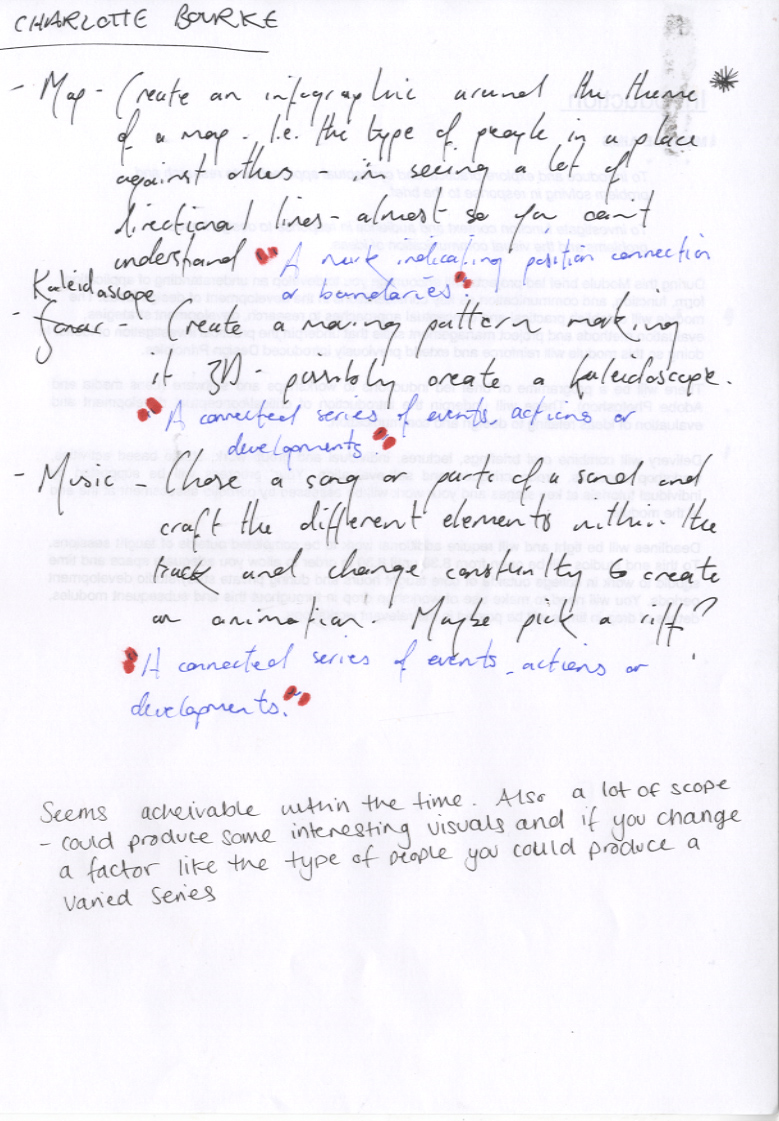
We had to decide on three of the ten ideas we had come up with.  My three included those above.  My favourite idea is the last- visualisation of sound.  This would be interesting to explore further from my last concept within the 'Design is Doing' competition brief, as it was a brief that I thoroughly enjoyed.  In the sense of 'taking the concept further' my idea is to create a 3-D sculpture that has stripped down a specific piece of music to involve separately the different elements within this music, i.e.vocals, bass, beat etc.  This may not be what I end up doing but I feel such a hand crafted technique works well with this exploratory brief- the brief allows me to experiment, so I should take advantage of this by trying something new.

Monday, 7 March 2011

Communication is a Virus.

Before we obtained the second half of the brief that would explain what exactly our problem was going to be, we were asked to come up with a form of identity for our assigned group.  Below is what we designed.  We had 20 minutes to come up with the design.


We decided on listing our four main skills and attributes as designers.  We also used the name 'Fantastic Four' because of its' already existing connotations of 'team' and 'excitement'.  We decided to make the fantastic bold, sans serif and italic to force it out to the viewer.  The four was italic and serif to give a contrast against the fantastic, which on a deeper level shows our versitility.


We were then asked to design an identity that would appeal to potential clients, something that listed our qualities in a way that they would remember.  Because one of our four main attributes was 'humour' we decided to take that further.  We wanted a sharp, bold phrase that wouldn't be too much to remember.  So, we first decided on 'quick'- because we know what were doing so therefore can complete a task, fast.  We aslo used 'cheap' because we're students and will essentially design for free.  The final word we chose was 'easy'- to tie up the concept of a cheap graphic design hoar- which is supposed to be taken tongue in cheek.  We then decided that easy wasn't exactly an attribute of ours and we were only using it to make the concept solid.  'Flexible' seems a much more easily transferable term, as we are 'flexible' within our designs, we're not stuck in our ways.


After this we were given the problems.  The two below are the ones we chose:


All of our first instincts were to go with the two problems circled above, so, we planned to come up with ideas for both overnight, come back the next day and decide on the one with the most potential.  
Collectively we decided on 'Encourage someone to try something new'.
TAKE PHOTOS

InDesign Workshop briefing.

For this brief we've been assigned a parter to design a double page spread around.  The subject matter can go in any direction just so long as it links to the parter-  In my case, Luis Bachini.


So, we started off by asking all the mundane questions, i.e. How old are you? What's your hometown? Favourite colour? etc.


We also sent eachother some photographs of our rooms and the contents that we thought said something about us.  Below are the images Luis sent me:


From all of this I got the impression that Luis is slightly anal in his tidy habits- much like me.  And also has some surprising traits such as aligning everything on his walls so that they are perfect.  I thought that this could easily translate into what we are supposed to experiment with for this brief: layout design.  It seems to me to be a trait of a graphic designer to have some minor form of OCD within their everyday 'non-designing' lives, it is just, for me, lucky that this theme of alignment fits so well with the brief.  
A few ideas:


I'm not totally fixed on this subject matter.  I've also looked into other contexts a double paged spread can be found and what connotations they possess.  So for example I could focus on more of a journal context, giving more of an insight into Luis' more personal thoughts.  I'll keep designing and conferring with Luis to make sure i'm on track.

Design is about Doing. HOW Books design and ideas.

Thursday, 3 March 2011

Book Works

Today Defined 'learning the hard way'.
However, I will never again send thirteen copies of my designs to print without proofing, proofing again, then asking someone else to proof it.  Below: The text in the top far left and third from the left sections are facing the same way as the type on the lower half- so when it came to folding the book it would come out upside down- something I neglected to notice until after the prints were finished.


Another issue I encountered when attempting to print this book was the stock in the printer.  Every so often the paper would tear and jam not only because of the weight of the stock but also because the ink is very close to the edges of the paper, making it wet and malleable- clearly the printer cannot handle this.  However, I thought a few things might go wrong so I bought extra stock in case of such issues.


After all of my problems because of the stock I have used the process has still been relatively cheap, and if all my books were to be sold I would still be making a profit.
Below is the final resolution.  Rectified.  Proofed.  


Quality image soon.

Wednesday, 2 March 2011

Book Works, Screenprint experimentation.


 The general look to all of these prints is untidy.  When asking what people thought about the screenprinted version against the digitally printed version I was told that the screenprinted technique gave an 'organic quality', one that reflects the subject matter of the book.  However, I was also told that the text is unclear and difficult to read.  I chose function over form in this case and ditched the screenprinted resolution.  I think that because (hopefully) many people of all ages are going to be reading this I want to get my message across as easily as possible- therefore clarity is very important.

Screenprint induction, Blenheim Walk.

Having already been taught the principles of screenprinting from my elective- how to set your images up; how to clean the screen; how to mix the paint/ink etc, I thought it would be valuable to go over this once again, whilst gaining access into our current buildings screenprinting facilities.
Below is a CMYK design that the tutor had already designed for us.  It was more a case of getting to grips with multiple colour screenprints than producing something of our own.