
Showing posts with label OUGD103. Show all posts
Showing posts with label OUGD103. Show all posts
Thursday, 31 March 2011

Friday, 11 March 2011
Communication is a Virus, initial ideas.
After thinking about how ideas and information spreads, we realised that from our research most of the time it's through word of mouth- unless you have a lot of money for big time advertising. Essentially this is 'the domino effect' - you tell two people, all of those people tell two people- quickly the number multiplies. This is the general principle we are going to be using throughout the project.


Above are the final board designs for our pitch on friday outlining the concept, the content and our method of delivery.
Monday, 7 March 2011
Communication is a Virus.
Before we obtained the second half of the brief that would explain what exactly our problem was going to be, we were asked to come up with a form of identity for our assigned group. Below is what we designed. We had 20 minutes to come up with the design.

We decided on listing our four main skills and attributes as designers. We also used the name 'Fantastic Four' because of its' already existing connotations of 'team' and 'excitement'. We decided to make the fantastic bold, sans serif and italic to force it out to the viewer. The four was italic and serif to give a contrast against the fantastic, which on a deeper level shows our versitility.

We were then asked to design an identity that would appeal to potential clients, something that listed our qualities in a way that they would remember. Because one of our four main attributes was 'humour' we decided to take that further. We wanted a sharp, bold phrase that wouldn't be too much to remember. So, we first decided on 'quick'- because we know what were doing so therefore can complete a task, fast. We aslo used 'cheap' because we're students and will essentially design for free. The final word we chose was 'easy'- to tie up the concept of a cheap graphic design hoar- which is supposed to be taken tongue in cheek. We then decided that easy wasn't exactly an attribute of ours and we were only using it to make the concept solid. 'Flexible' seems a much more easily transferable term, as we are 'flexible' within our designs, we're not stuck in our ways.
After this we were given the problems. The two below are the ones we chose:

All of our first instincts were to go with the two problems circled above, so, we planned to come up with ideas for both overnight, come back the next day and decide on the one with the most potential.
Collectively we decided on 'Encourage someone to try something new'.
TAKE PHOTOS

We decided on listing our four main skills and attributes as designers. We also used the name 'Fantastic Four' because of its' already existing connotations of 'team' and 'excitement'. We decided to make the fantastic bold, sans serif and italic to force it out to the viewer. The four was italic and serif to give a contrast against the fantastic, which on a deeper level shows our versitility.

We were then asked to design an identity that would appeal to potential clients, something that listed our qualities in a way that they would remember. Because one of our four main attributes was 'humour' we decided to take that further. We wanted a sharp, bold phrase that wouldn't be too much to remember. So, we first decided on 'quick'- because we know what were doing so therefore can complete a task, fast. We aslo used 'cheap' because we're students and will essentially design for free. The final word we chose was 'easy'- to tie up the concept of a cheap graphic design hoar- which is supposed to be taken tongue in cheek. We then decided that easy wasn't exactly an attribute of ours and we were only using it to make the concept solid. 'Flexible' seems a much more easily transferable term, as we are 'flexible' within our designs, we're not stuck in our ways.
After this we were given the problems. The two below are the ones we chose:

All of our first instincts were to go with the two problems circled above, so, we planned to come up with ideas for both overnight, come back the next day and decide on the one with the most potential.
Collectively we decided on 'Encourage someone to try something new'.
TAKE PHOTOS
InDesign Workshop briefing.
For this brief we've been assigned a parter to design a double page spread around. The subject matter can go in any direction just so long as it links to the parter- In my case, Luis Bachini.

So, we started off by asking all the mundane questions, i.e. How old are you? What's your hometown? Favourite colour? etc.

We also sent eachother some photographs of our rooms and the contents that we thought said something about us. Below are the images Luis sent me:

From all of this I got the impression that Luis is slightly anal in his tidy habits- much like me. And also has some surprising traits such as aligning everything on his walls so that they are perfect. I thought that this could easily translate into what we are supposed to experiment with for this brief: layout design. It seems to me to be a trait of a graphic designer to have some minor form of OCD within their everyday 'non-designing' lives, it is just, for me, lucky that this theme of alignment fits so well with the brief.
A few ideas:
I'm not totally fixed on this subject matter. I've also looked into other contexts a double paged spread can be found and what connotations they possess. So for example I could focus on more of a journal context, giving more of an insight into Luis' more personal thoughts. I'll keep designing and conferring with Luis to make sure i'm on track.

So, we started off by asking all the mundane questions, i.e. How old are you? What's your hometown? Favourite colour? etc.

We also sent eachother some photographs of our rooms and the contents that we thought said something about us. Below are the images Luis sent me:

From all of this I got the impression that Luis is slightly anal in his tidy habits- much like me. And also has some surprising traits such as aligning everything on his walls so that they are perfect. I thought that this could easily translate into what we are supposed to experiment with for this brief: layout design. It seems to me to be a trait of a graphic designer to have some minor form of OCD within their everyday 'non-designing' lives, it is just, for me, lucky that this theme of alignment fits so well with the brief.
A few ideas:
I'm not totally fixed on this subject matter. I've also looked into other contexts a double paged spread can be found and what connotations they possess. So for example I could focus on more of a journal context, giving more of an insight into Luis' more personal thoughts. I'll keep designing and conferring with Luis to make sure i'm on track.
Monday, 28 February 2011
Design is about Doing. HOW Design. Initial Research

The first step was to highlight all the obvious opposites that exist; hot/ cold; heavy/ light; shiny/ matt etc. I then went on to look into other avenues of opposites. For example I thought about a more physical form of opposite i.e. a transvestite. -an living oxymoron. Then, onto more conceptual, i.e. words that mean more than one thing. However, I realised this was not entirely an opposite so when it came to decision time I didn't know what to choose at all. So, I decided to base my decision on the opposite I looked at first on the sheet above:
Proposal:
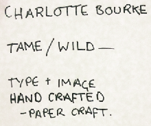
Definitely not the most original start. However, i'm confident that it can be made into something more. There is definitely potential, I just have to be careful not to be cliche about it. Below: I've written down everything that (to me) has the potential to be tame and wild. For example a pet such as a dog can be tame, yet a wolf can also be wild when absent from humans in its' life.

It would be wise to choose a select few and work on them given that we only have a week for this brief. The four that interest me the most are: animals// hair// Jeykll and Hyde// sound. I also think it would be an interesting and refreshing angle to pick one that I haven't initially found potential with. So, using the same tactic as before I chose the first that I looked at and came up with 'wires'. For now my focus will be based around these five areas:
Animals/
Hair/
Jekyll and Hyde/
Sound/
Wires.


Wednesday, 19 January 2011
Grids, Type and more "Stuff"

General layout taken from a music magazine. I've found that from this I need to be more specific and focus in on things like what typeface I am using and also research more into official terms to create a more precise piece that would be ready to go to print.
Tuesday, 11 January 2011
Grids, Type and "Stuff"
Type:
The X-height is the size of the distance between the baseline and the top of lower case letters within type. Depending on the typeface the way the body is filled can change the x-height. The x-height in Sans Serif typefaces is typically larger because the ascender and descender aspects of the letterforms being smaller.
As a rule, the 'O' in type always sticks slightly above and below the x-height because optically it would look smaller s it was the same.

Readability:
- Changing the typeface can increase its' readability if it reflects the general mood of the words.
- It is a common misconception that capital letters increase readability, this is not true. If grammar is used correctly then readability is increased. It separates words and draws attention to specific areas of type.
- Kerning; the space between a pair of letters. This can increase readability by spacing the letters apart. I.e. 1958 and 1 958.
If you wanted the focus on the number 1, then you would do as above. The negative space around the number draws attention to it.
- If the type was reversed out (for example) it can go either way, depending on the content. Usually the tracking has to be increased when reversing out because optically the black creates less negative space around the letterforms.
-Increasing the tracking will create more space between a group of letterforms making it more open (or closed)- so can increase readability in that sense. You can also set the tracking for letterforms to overlap each other, purposefully decreasing readability.
Appropriateness:
Fonts can be descriptive of words. If the viewer has an understanding of popular culture (even without realising) then the type of font will successfully intensify reinforce its' meaning.
The well known site dafont.com is a good example of appropriateness. It categorizes different styles that reflect their heading. For example, I found this font in the category 'Destroy':

It successfully reflects the word 'destroy' because of what the word connotes. It conjures up imagery of rough textures, things being smashed and impact. All of which in my opinion are visible in this typeface. It is appropriate because the viewer can relate to this idea of destruction because the designer has incorporated the things that are associated with the subject they are trying to get across- it even heightens the message.
Layout:
Layout is key. A change to somethings layout emphasises different areas in a design.
For example, a manual needs large page numbers because the viewer will usually be referencing different languages, areas in relation to what stage they are at, and different problems with their product- it isn't a novel, they know where they need to be and don't need to read the whole thing. You must design appropriately to the content.
The Grid:
The design of a grid is also designed appropriately to its' content. For example a play scrip has a basic and specific design that enables the reader to read the type in the simplest way possible.


Above is the practical aspect of the seminar. We had to decide what the layout for the newspaper was through analysing different columns from different pages. This is what we came up with.
Below is another grid design for the magazine 'Private Eye'.

It is not as complex as 'The Guardian'. Perhaps this is because The Guardian has a much wider audience than Private Eye, so therefore has many different articles that this audience have to respond to. The layout aids in reinforcing the message of the article- they need the freedom to be able to make an image larger, or increase the size of a quote.
The X-height is the size of the distance between the baseline and the top of lower case letters within type. Depending on the typeface the way the body is filled can change the x-height. The x-height in Sans Serif typefaces is typically larger because the ascender and descender aspects of the letterforms being smaller.
As a rule, the 'O' in type always sticks slightly above and below the x-height because optically it would look smaller s it was the same.

Readability:
- Changing the typeface can increase its' readability if it reflects the general mood of the words.
- It is a common misconception that capital letters increase readability, this is not true. If grammar is used correctly then readability is increased. It separates words and draws attention to specific areas of type.
- Kerning; the space between a pair of letters. This can increase readability by spacing the letters apart. I.e. 1958 and 1 958.
If you wanted the focus on the number 1, then you would do as above. The negative space around the number draws attention to it.
- If the type was reversed out (for example) it can go either way, depending on the content. Usually the tracking has to be increased when reversing out because optically the black creates less negative space around the letterforms.
-Increasing the tracking will create more space between a group of letterforms making it more open (or closed)- so can increase readability in that sense. You can also set the tracking for letterforms to overlap each other, purposefully decreasing readability.
Appropriateness:
Fonts can be descriptive of words. If the viewer has an understanding of popular culture (even without realising) then the type of font will successfully intensify reinforce its' meaning.
The well known site dafont.com is a good example of appropriateness. It categorizes different styles that reflect their heading. For example, I found this font in the category 'Destroy':

It successfully reflects the word 'destroy' because of what the word connotes. It conjures up imagery of rough textures, things being smashed and impact. All of which in my opinion are visible in this typeface. It is appropriate because the viewer can relate to this idea of destruction because the designer has incorporated the things that are associated with the subject they are trying to get across- it even heightens the message.
Layout:
Layout is key. A change to somethings layout emphasises different areas in a design.
For example, a manual needs large page numbers because the viewer will usually be referencing different languages, areas in relation to what stage they are at, and different problems with their product- it isn't a novel, they know where they need to be and don't need to read the whole thing. You must design appropriately to the content.
The Grid:
The design of a grid is also designed appropriately to its' content. For example a play scrip has a basic and specific design that enables the reader to read the type in the simplest way possible.

Above is the practical aspect of the seminar. We had to decide what the layout for the newspaper was through analysing different columns from different pages. This is what we came up with.
Below is another grid design for the magazine 'Private Eye'.

It is not as complex as 'The Guardian'. Perhaps this is because The Guardian has a much wider audience than Private Eye, so therefore has many different articles that this audience have to respond to. The layout aids in reinforcing the message of the article- they need the freedom to be able to make an image larger, or increase the size of a quote.
Subscribe to:
Posts (Atom)