Monday, 14 February 2011

Photoshop Brief

Firstly I began designing the back of the postcards which I have decided are all going to be the same to keep consistency.  
So here I have duplicated the layer and selected the blue light with the magic wand tool then I desaturated it.  This has put the focus on the orange light and made a higher contrast between the orange and the black.


Next I transformed the duplicate layer and turned it 180 degrees.  I then experimented with brightness and contrast creating more of a shape than an image.


In my opinion the first design is the most successful in communicating the colour orange.  It is the most vivid and saturated against the black.  Unless I come up with a better design I will be using this resolution.

Friday, 11 February 2011

Collection 100, Leaflet design

After Fridays crit i've found that I can take this idea of charity promotion much further.  To make the brief live I was going to place posters in areas where people would notice them.  However, if I create a leaflet it is arguably a more direct way of communicating to them- if I make it visually engaging enough.


Below are the beginnings of my design.  I have started looking at how I can fold the leaflet and what these folds conceal and reveal.  I think one of the main aspects to making the leaflet engaging is to make it interactive- an interesting fold can achieve this.
Check out Context blog for some interesting folds.


The front/ title page is no.1.  Then open it up and 'technically' it would be page 5 next to page 2, but for the purpose of unveiling information it is no.3.  The viewer then pulls no.3 to the right to reveal 4 and 5- hopefully a full final resolution that works with.


Collection 100, final resolution posters.


I took the brief live by placing the posters around college and student accommodation.  I felt that this was relevant because my audience is students... with bags.  They received some attention from people and when I asked what drew them to the piece they said 'The bright colours and high contrast'.


Below are my final designs for the infographic posters:


Monday, 7 February 2011

Initial Ideas, Book Works

'A's within scaffolding.'


This idea shows the construction of an 'a' using scaffolding.  The reason I chose scaffolding to begin with is because the letterform 'a' (from what I have seen) is always present.
So this basically shows an image of an a.  Once they begin turning the pages they see the anatomy of the 'a' using the existing image cut-up.


I'm not sure this idea of construction is working.  It is interactive, but not visually engaging enough.  I think that a more simplistic look would be successful in appealing to a wider audience. 
-not interesting enough.
So rather than focusing on the letterform 'A', I have decided to check out words of interest that begin with 'a'.

I found this website.  It is fairly informative.
Some of my personal favourites include:
(one to note: 'allantoid')


aithree-toed sloth


agrostologyscience or study of grasses


affricateconsonant that begins as a plosive and ends as a fricative


adeciduateevergreen; coniferous


actinismaction of solar radiation causing chemical change


acipensersturgeon


autecologystudy of ecology of one species


aspergeto sprinkle


apodallacking feet


allantoidshaped like a sausage


amanouslacking hands

Visual Language brief: 'book works'


This brief revolves around the 'Hot dog fold'.
So first I was trying to get to grips with its general folded design.


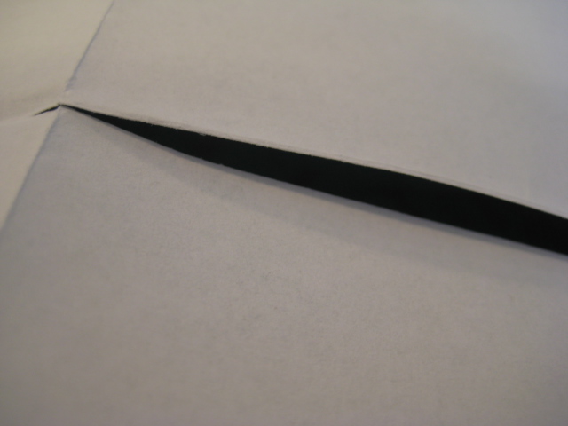
To begin with you fold the (this is A4 but other sizes also work) paper in half then in half again.  You then fold in the opposite direction once.  After this you cut down the centre of the page along the fold, leaving once folds height at the top and bottom.  Hold the paper landscape and push together so that the fold in the centre pushes to the back, it will now look like an A5 sheet of paper- fold it from top to bottom and it is complete.  There should be 8 leaves including the front and back.

Collection 100, infographic posters


These are my current designs for my promotional posters.  They raise awareness of the amount of money people have.
Below is an alternate design I have created which also works well, however, when placing the three posters in order and asking people which one they thought helped it flow everyone said the rectangular shape above.


I thought that this square shape would fit the general theme of shapes within these designs.  However, it seems that the slight variation makes people focus on the top left image moreso than the one above.

Thursday, 3 February 2011

Infographics experimentation, Collection 100: Cont.

A triptych?
Perhaps 3 infographics pieces which work solely together.
OR
Three that work together and at the same time are successful in communicating standing alone.
I.e.


If all three have a small key at the bottom of the page then they will work alone.  But, to me, the shapes and weighting of these three designs work visually together.  I think the key is to frame the middle piece with two heavily weighted shapes at either side.  This is coming from my original infographic and the weight of the circle:


My next design shows the total amount (unlike the piece above which represents the total amount of each type of coin).  In this case it is simplicity.